Missing Document Title
theme: Next, 1
[fit] Web Fundamentals
[fit] Intro to CSS
[fit]CSS
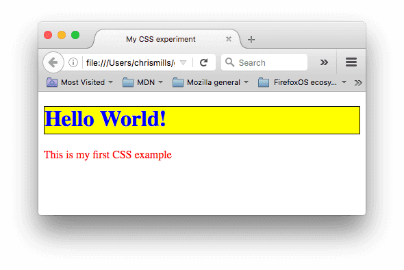
CSS is a language for specifying how documents are presented to users — how they are styled, laid out, etc.
CSS affects HTML
In order to use CSS we must first define our HTML content. This is often why developers lay out the HTML contents of a page/app before writing their CSS.
CSS affects HTML
CSS uses the structure and attributes of our HTML to identify elements on the page to apply style to. This is also why the semantics of the page are so important.
Example
Vocabulary
Before we dive into the tech details of CSS, we need some vocabulary:
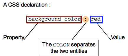
Properties: Human-readable identifiers that indicate which stylistic features you want to change.
Values: Indicates how you want to change those stylistic features
Vocabulary
A property paired with a value is called a CSS declaration. CSS declarations are put within CSS Declaration Blocks. And finally, CSS declaration blocks are paired with selectors to produce CSS Rulesets (or CSS Rules).
Declaration
^ There are more than 300 different properties in CSS and nearly an infinite number of different values. Not all pairs of properties and values are allowed; each property has a specific list of valid values defined for it.
Declaration Block
^ Declarations are grouped in blocks, with each set of declarations being wrapped by an opening curly brace, { and a closing one }.
[fit] Selectors + Declaration Block = Ruleset
^ selector — a pattern that matches some elements on the page.
Example Again
^ Point out the various declarations, blocks, and selectors
Shorthand (for the lazy developer)
- Some properties like
font,background,padding,border, andmarginallow for shorthand. - They allow multiple properties in a single line
Shorthand example
This
is the same as:
[.autoscale: true]
Selectors
Selectors follow a syntax that allows us to target specific sets of elements on the page.
Simple selectors
Attribute selectors
Pseudo-classes
Pseudo-elements
Combinators
Multiple selectors
Simple Selectors - Tag Selector
One type of simple selector is the Tag Selector
Selects all elements using that tag.
This will make the <div> elements blue
Simple Selectors - Class Selectors
Instead of selecting elements based on the type of tag, we can select elements based on their class property.
The class selector consists of a dot, ., followed by a class name.
Example
Simple Selectors - ID Selector
The ID selector consists of a hash/pound/octothorpe symbol #, followed by the ID name of a given element.
Example
Pseudo Class
Specifies style applied only when element is in a certain state.
Added to the end of a selector, preceded by a colon
:
Pseudo Selectors
:first-child- represents the first element among a group of sibling elements.:focus- represents an element (such as a form input) that has received focus.:hover- matches when the user interacts with an element with a pointing device, but does not necessarily activate it. It is generally triggered when the user hovers over an element with the cursor (mouse pointer).
Pseudo Selectors
:first-child- matches the first element within a group of siblings.:nth-child- matches elements based on their position in a group of siblings.
Pseudo Elements
Pseudo-elements are very much like pseudo-classes, but they have differences.
They are keywords, this time preceded by two colons ::, that can be added to the end of selectors to select a certain part of an element.
Pseudo Elements
Combinators
Using one selector at a time is useful, but can be inefficient in some situations.
CSS selectors become even more useful when you start combining them to perform fine-grained selections.
CSS has several ways to select elements based on how they are related to one another.
[.autoscale: true]
| Name | Syntax | Selects |
|---|---|---|
| List | A, B | Any element matching A and/or B |
| Descendant | A B | Any element matching B that is a descendant of an element matching A |
| Child | A > B | Any element matching B that is a direct child of an element matching A. |
| Adjacent | A + B | Any element matching B that is the next sibling of an element matching A |
| General sibling | A ~ B | Any element matching B that is one of the next siblings of an element matching A |
Values
There are many types of CSS property values to consider, from numerical values to colors to functions that perform a certain action.
Some of these rely on particular units for specifying the exact values they are representing.
Do you want your box to be 30 pixels wide, or 30 centimeters, or 30 em?
Some values represent things like length and color.
How to decide between different length units.
We are going to concentrate on px, em, and rem.
For other useful sizes such as vh (view height), vw (view width), and others, see the MDN.
Google: mdn css length
px
[.autoscale: true]
is a unit of length which roughly corresponds to the width or height of a single dot that can be comfortably seen by the human eye without strain, but is otherwise as small as possible.
The goal is to try to have the distance 96px equal about 1 inch on the screen, regardless of the actual pixel density of the screen.
If the user is on a phone with a pixel density of 266 DPI, and an element is placed on the screen with a width of 96px, the actual width of the element would be 266 device pixels.
px
Using px for sizing things can be troubling.
Good for things that are already measured in pixels, like the size of an image. But for things like margins, paddings, and spacing they can be difficult.
em
Represents the calculated font-size of the element.
1emequals thefont-sizeof the parent,2emis twice thefont-sizeof the parent, etc.
This is relative to the font-size of the parent.
This can be confusing if a rule of 2em is applied to different elements whose parent's font-size has been customized.
In this case 2em of padding won't be the same amount.
rem
Represents the calculated font-size of the root element.
This is always scaled to the font-size of the root element. Thus is consistent against all elements regardless of their specific, calculated font-size
rem as (my/our) favorite
Currently using rem is my preferred style.
Allows for consistent sizing, yet scales to the base font size.
But it is highly debatable.
For instance, rem is not modular in that it scales to the root, not to a containing element.
See https://zellwk.com/blog/rem-vs-em/
Cascade
What happens if multiple rules apply?
What properties are inherited from their parent elements?
Let's define what the CSS cascade is, what specificity is, what importance is, and how properties inherit from different rules.
Cascade
CSS is an abbreviation for Cascading Style Sheets. "C"ascade is important.
The order of CSS rules matter, but it's more complex than that. Cascade depends on three factors:
- Importance
- Specificity
- Source order
^ (these are listed in order of weight — earlier ones will overrule later ones):
Importance
In CSS, there is a special piece of syntax you can use to make sure that a certain declaration will always win over all others: !important.
[.autoscale: true]
Warning (...Will Robinson...)
It is useful to know that !important exists so that you know what it is when you come across it in other people's code.
However, we strongly recommend that you never use it unless you absolutely have to.
One situation in which you may have to use it is when you are working on a system where you can't edit the core CSS modules, and you really want to override a style that can't be overridden in any other way.
But really, don't use it if you can avoid it, because !important changes the way the cascade normally works, so it can make debugging CSS problems really hard to work out, especially in a large stylesheet.
Specificity
Specificity is basically a measure of how specific a selector is — how many elements it could match.
Element selectors have low specificity.
Class selectors have a higher specificity, so will win against element selectors.
ID selectors have an even higher specificity, so will win against class selectors.
Specificity
The amount of specificity a selector has is measured using four different values (or components), which can be thought of as thousands, hundreds, tens and ones — four single digits in four columns
| Column | Score |
|---|---|
| Thousands | Score one in this column if the declaration is inside a style attribute, aka inline styles. Such declarations don't have selectors, so their specificity is always simply 1000. |
| Hundreds | Score one in this column for each ID selector contained inside the overall selector. |
| Tens | Score one in this column for each class selector, attribute selector, or pseudo-class contained inside the overall selector. |
| Ones | Score one in this column for each element selector or pseudo-element contained inside the overall selector. |
| Selector | Thousands | Hundreds | Tens | Ones | Total specificity |
|---|---|---|---|---|---|
h1 | 0 | 0 | 0 | 1 | 0001 |
h1 + p::first-letter | 0 | 0 | 0 | 3 | 0003 |
li > a[href*="en-US"] > .inline-warning | 0 | 0 | 2 | 2 | 0022 |
#identifier | 0 | 1 | 0 | 0 | 0100 |
| No selector, with a rule inside an element's style attribute | 1 | 0 | 0 | 0 | 1000 |
Specificity
This is a good Specificity Calculator you can use to evaluate your own CSS selectors
Box Model
Every element within a document is structured as a rectangular box inside the document layout, the size and "onion layers" of which can be tweaked using some specific CSS properties.

Padding
Padding refers to the inner zone of a CSS box — between the outer edge of the content box and the inner edge of the border.
The size of this layer can be set on all four sides at once with the padding shorthand property, or one side at a time with the padding-top, padding-right, padding-bottom and padding-left properties.
[.autoscale: true]
Border
Border sits between the outer edge of the padding and the inner edge of the margin.
By default the border has a size of 0 — making it invisible — but you can set the thickness, style and color of the border to make it appear.
The border shorthand property allows you to set all of these on all four sides at once, for example border: 1px solid black.
This can be broken down into numerous different longhand properties for more specific styling needs.
Margin
Margin pushes up against other CSS boxes in the layout. It behaves rather like padding
The shorthand property is margin and the individual properties are margin-top, margin-right, margin-bottom, and margin-left.
Advanced box manipulation
When you set the size of a box with absolute values (e.g. a fixed pixel width/height), the content may not fit within the allowed size, in which case the content overflows the box.
To control what happens in such cases, we can use the overflow property.
Overflow
auto | If there is too much content, the overflowing content is hidden and scroll bars are shown to let the user scroll to see all the content. |
hidden | If there is too much content, the overflowing content is hidden. |
visible | If there is too much content, the overflowing content is shown outside of the box (this is usually the default behavior.) |
Types of CSS boxes
Everything we've said so far applies to boxes that represent block level elements.
However, CSS has other types of boxes that behave differently.
The type of box applied to an element is specified by the display property.
There are many different values available for display, we will focus on the three most common ones; block, inline, and inline-block.
Read up at MDN:
https://developer.mozilla.org/en-US/docs/Learn/CSS/Building_blocks/The_box_model
display: block;
A block box is defined as a box that's stacked upon other boxes (i.e. content before and after the box appears on a separate line), and can have width and height set on it.
The whole box model as described above applies to block boxes.
display: inline;
An inline box is the opposite of a block box: it flows with the document's text (i.e. it will appear on the same line as surrounding text and other inline elements, and its content will break with the flow of the text, like lines of text in a paragraph.)
Width and height settings have no effect on inline boxes; any padding, margin and border set on inline boxes will update the position of surrounding text, but will not affect the position of surrounding block boxes.
display: inline-block;
An inline-block box is something in between the first two: It flows with surrounding text and other inline elements without creating line breaks before and after it unlike a block box, but it can be sized using width and height and maintains its block integrity like a block box.
It won't be broken across paragraph lines like an inline box.
Borders
Along with the box model we can take a look at the options we have for styling the border portion of a content box.
Border radius
Rounded corners on boxes are an incredibly popular feature on web sites — so popular in fact that browsers implemented a property specifically for implementing rounded corners easily: border-radius.
To put a different size of border radius on different corners, you can specify two, three or four values, rather like you can with padding and margin:
Border radius
As a last point, you can also create elliptical corners (where the x radius is different to the y radius.) The two different radii are specified separated by a forward slash (/), and you can combine this with any combination of values, as indicated above.
For example:
Apply This!
SDG Safari

First Step - Content!
[.column]
[.column]
Style top-to-bottom and outside-in
CSS Normalizer
This removes minor variations between browser's default styles
Import fonts
Google Fonts (https://fonts.google.com) is a good starting place
Apply some body styles
Style the header and the footer
Style our links
Lord Vader Former Handle Anakin
Lord Voldemort Fears Hogwarts Alumni
---- --------- ------ -------- ------
Link Visited Focus Hover Active
Lists
Headers
Images
Articles
Style the form
Format our red hearts


