Workflow
Reading
When getting started on a new application, it is useful to start with a sketch of the site. Starting with this sketch in a narrow mobile size will help you reflect on the core aspects of the site as we mentioned.
Start with a sketch
Nearly every website or app should start with a sketch of the user interface. These sketches are typically low resolution/fidelity and serve to show both the developer and the customer what the general look and flow of the application should be.
In their most basic forms, these sketches can be pencil drawings, whiteboard diagrams, or vector drawings in a digital tool like Visio or another design application.
A popular term for this type of sketch is called a wireframe and implies that the generated images are meant to be a schematic or a blueprint.
Some popular user interface sketching applications even generate drawings in a form that looks hand-drawn. This is to give the viewer the impression that these are conceptual and are not meant to reflect the actual look and feel of the application.
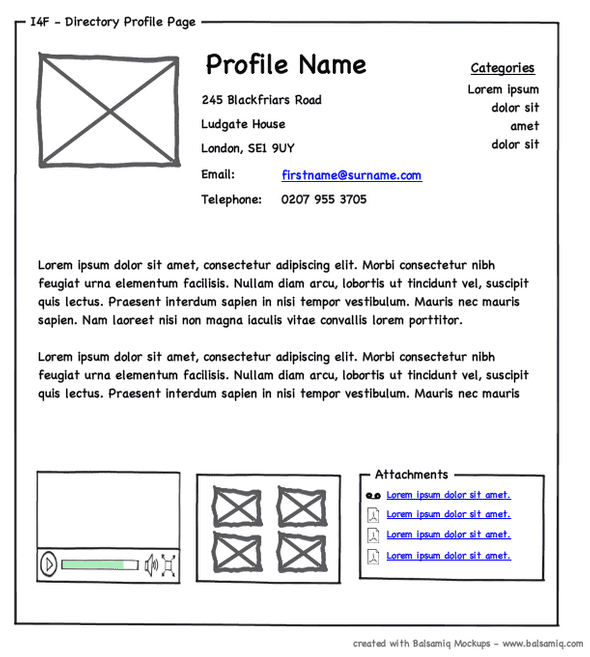
Also at this stage, the content is mostly empty rectangles for images, links, and input. For text, we use squiggly lines. If you want to include images or text, use Lorem Ipsum text and generic grayscale images.
Example
This mockup is made with the popular Balsamiq tool.
Next Step
Typically we will wireframe as many of the "pages" of our application as we can before generating any HTML or CSS. This helps us determine the various assets we will need, what pages need to be created, and what information we will be collecting from users and what information we will be showing to the user. This will be critical when we start designing APIs and building backend services for the application.
Ready to make HTML and CSS?
When we are ready to make the HTML and CSS for our application, we will start coding with our browser in a configuration that is a mobile device size.
There are a few ways to do this. The first is to configure your editor and your browser side-by-side and give the browser a narrow but tall aspect ratio. This will also give your editor maximum space for you to code in.
The second is to use your browser's development tools to set the view into a
mobile size. In your browser, we do this by engaging Developer Tools and
clicking this icon:
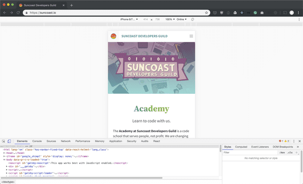
Once this view is engaged, we can select several options to change the mobile view of our web page. For instance, the Suncoast Developers Guild website looks like this when in the browser's mobile view:
NOTE: This view is purely an estimation of the way the mobile browser will work. Selecting an iPhone or Android device simply scales the browser to that size but does not reproduce any of that device's specific behaviors. Real testing on physical mobile devices is often still required.


